Sidra Knaus
Creating a brand identity can be daunting. With the right tools, however, you can break your brand down into sections and focus on just one piece at a time.
When developing a brand, there are many different aspects to think through. The overall document that is used to outline the identity of the brand is called a creative brief. The creative brief checklist is extensive so we aren’t going to get into all that right now.
Brand elements include common brand associations (colors, fonts, logo, tagline, and tone) and the five senses (look, smell, sound, taste, and feel).
To determine my brand elements, I first determined what tone I wanted my brand to have. Tone is the overall energy of your brand – loud or quiet, minimalist or maximalist, gleeful or melancholy, modern or traditional. I decided I wanted my personal brand to be:
Humorous,
Genuine,
Joyful,
Kind,
Warm,
Trustworthy,
Honest.
Once I determined what I wanted my brand’s tone to be, I moved on to the rest of my brand elements.
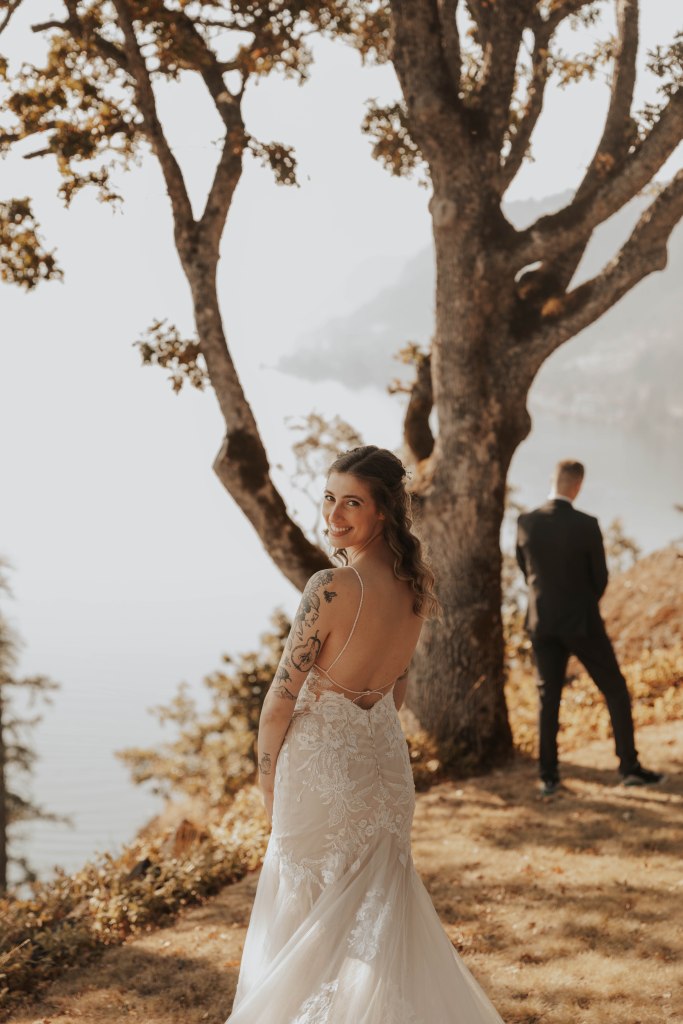
I got married in October of 2022, so I thought it would be fun to pull my brand colors from a wedding photo. I chose this photo because you can see the love radiating from our family and wedding party over us – the same bubbly feeling I hope my brand will give to others.
I used coolers.co to generate a color palette from this photo. It was so easy – I just uploaded my photo to their Image Picker tool (Tools>Image Picker), selected Browse Image, uploaded my own photo, and then explored the different palettes chosen by the website under “Picked palettes”. To change a color in a palette, first click the color in the palette you want to change. Then click and drag the circle in your image to find a color you would rather have. You can also increase or decrease the number of colors in your palette by clicking the + or – beside your palette.
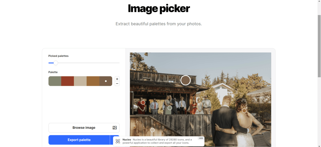
Here’s a side-by-side of the image I chose and the palette I wound up with:


I chose my fonts as I created my website and logo – it somewhat depended on what fonts were readily available on wordpress.com. To be honest, I didn’t want to deal with uploading a custom font to my site.
When making my logo, I played with the fonts until I found one I liked. It happened to be Montserrat, and when I checked on my WordPress site, it was also available there!
Montserrat feels more like a title and heading font – it’s a little round and large for body text. So, to choose a body font, I went into my WordPress website and once again played with fonts until I found one I felt like went well with Montserrat. I landed on Libre Franklin (the font this blog is being written in).
Brace yourself, the next paragraph is in the Montserrat font.
This is Montserrat in body-text form. I do like it, but there’s something about having separate fonts for headings or titles and for body text. I like how Libre Franklin is more compact and just slightly bolder, taking up less space while standing out a little more.
I created my logo on Canva.com using one of their many free templates. I just found one I liked, customized the colors and words, and downloaded the design to my laptop (to be plastered on every single future thing I produce). Once I had my logo, I copied it and inverted the colors so I have a logo for dark and light backgrounds.


I wanted to keep my tagline short and simple, so I thought about my brand values and what is important to me. This is how I landed on
inspire kindness.
I want to be the type of person people aspire to be like. The kind of person you feel so safe and loved around that you can’t help but want to spread that energy. I have so many people like this in my life and, whether they know it or not, they inspire me to push myself to be the kindest, most patient, and best version of me I can be, and I am so grateful for them.
The final aspects of choosing your brand elements pull from the five senses. What sights, sounds, smells, tastes, and feelings/touches do I want my brand to be like? I suggest you close your eyes, breath, and just visualize what you want for your brand.
Where are you? What does it look like?
What do you hear?
What do you smell?
What can you taste?
What are you wearing? How does it feel on your body? The ground you are on – what does it feel like?
Because I was creating elements for my personal brand, I reflected on the times I’ve felt joy and calm. My five senses associations resulted in this:
Look
Happy; comforting; golden hour; starry night sky with a full moon
Smell
Soil just after a rainstorm; fresh-cut grass; warm laundry; coffee and tea; books
Sound
Songbirds on a summer morning; crickets and frogs at night; waves breathing in and out against the rocks; acoustic guitar drifting through the breeze on a cool summer night; raw vocals in an empty room
Taste
Coffee and tea; sweet and salty melting over your tongue; cold, crisp water at 2am; a cold beer after sweating in the sun
Feel
The feeling of lush grass on your feet; burying your feet into rough sand; curling up in a soft and cozy blanket by a fire on a cold, snowy day; sitting down after a long day on your feet; your happiest day; your parent carrying you to bed after being lulled asleep by the rocking of the car when you were a child; loved and seen
I hope you found this blog post useful, if not interesting!
Follow me on LinkedIn to follow along my journey to mastering marketing if you hope to learn more about marketing tools and knowledge.

Leave a comment